Excel, Palo and Sparklines

Cuboo is promoting openBI : Business Intelligence based on open source software.

His last post gives an example of how Palo, Excel and Sparklines for Excel can be used to create dashboards.

Not only Palo is a powerfull open-source database and Olap server, it also provides a great add-in, that allows users to easily embed pivot-table in Excel... very powerfull indeed.

The last step is to integrate sparklines for quick and efficient visualization.

Here is his article : “Pimp my spreadsheet” with Palo, and a screenshot of a dashboard using Sparklines for Excel.

Stick to the classics ?

I could not resist to post the VariChart version of the previous infographic.


It looks more readable to me...
File here.


Yes we can !

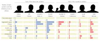
Robert just sent me an excellent example of heatmap use, based on a NY Times infographic and a recent post on Juice Analytics.

Juice Analytics gave up trying with Excel, but Robert said "Yes we can" et voilà !


The NY Times chart.


Robert's replica with Sparklines for XL heatMap function.

The file is available for download here.

Note : Robert added one line in the code to make the circles transparent, so the text behind could be seen.

Robert is also contribuiting to Chandoo's excellent blog Pointy Haired Dilbert.