Sharing files that use SFE formulas

Lee asked me the following : "Several people on my team share Excel files and it seems the only way Sparklines will work is if the file is run from the same directory on each computer.  Is there a way to set up the application so this is not required?"


My initial answer was to use the "Find & Replace" option :
Select all the cells of the sheet containing Sparklines formulas.
Do a "Ctrl+H" and delete all text between "=" and the SFE formula.

Instead, I updated the add-in (at least the XL2007 so far) with the excellent solution suggested by Jan Karel Pieterse here.


On opening a file, the add-in now checks is there is any existing link with a Sparklines.xla or Sparklines.xlam in a cell on the sheet.
If any Sparklines link is found, it is automatically updated and the local add-in is used instead.
Voila !
The add-in is available here. Let me know if it works !

Another Treemap sample file

Another Tremap sample file is available here.


This file shows how you can highlight a given category of sectors in an SfE Treemap and how to select parameters for color coding.


Using the stock quote symbol for sectors labels would make it more readable, but it shows that a lot of things can be achieved with this UDF and a few Vlookup().

Treemap. How does it work ?

Inspiration
I did some research on the net and mainly used Jonathan Hodgson's post on codeproject.com, dating from june 2004, that describes the Squarified treemap technique.
The  Squarified treemap algorithm is explained in an academic paper related to Human Computer Interaction (HCI) by Ben Shneiderman of the University of Maryland.
You can find here his excellent explanation that I followed to write this User Defined Function for Excel.
A great Treemap summary post on Juice Analytics' blog also helped me to provide the right features.


Parameters
First of all, remember that your data must be sorted with highest values at the top of the column (I know, this could easily be integrated in the UDF... sometime maybe).

The syntax of the UDF is :
TREEMAP(DataRange, DestinationRange, HeightPixel, WidthPixel, ColorRange, ColorScale, LabelRange, TooltipRange, HighlightPosition).

Only DataRange and DestinationRange are compulsory parameters. Others are optionals.

Lets describe each parameter :
- DataRange : Range of data containing the values used for the Size of the sectors. Must be 1 column by X rows.
As clearly explained on Juice Analytics blog : "Size of the boxes should be a quantity measure. 
The measures should sum up along the hierarchical structure of the data. 
The sum of all the elements in one branch need to sum to the value of the branch as a whole. 
Therefore, you can’t use ratios or dates or any other measure you wouldn’t use in a pie chart."

- DestinationRange : Range of cells that will contain the Treemap or 1 single cell...
If DestinationRange is a single cell, we have 2 cases with the following parameters :
  • HeightPixel or WidthPixel are not specified or both  = 0 :
Treemap will be displayed inside this unique cell (you should better make it big, or merge several cells)
  • HeightPixel AND WidthPixel are specified (integer number, lets say between 100 and 500):
Treemap will be displayed inside a rectangle of corresponding height and width (in Pixel or points, I am not sure).

This is especially important when comparing 2 Treemaps and you want to have exact proportionnality of their respective total surface (lets say representing my stock portfolio's value before and after the crisis... just a painful example).

- ColorRange : contains the data (number or text !) used to define Color of the individual sectors. If this parameter is left blank, all sectors will be grey... clear and simple (Hi Robert !)
Again Juice Analytics : "Color of the boxes is best suited to a measure of performance or change such as growth over time, average conversion rate, or customer satisfaction."
Color can also be used to identify categories.
ColorRange must have the same size as DataRange : One color per sector, so logically organize your data in identically sized columns.
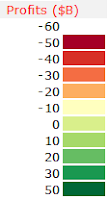
- ColorScale : No flexibility here. This has to be a range of 2 columns by Y rows, like for the Heatmap() UDF.

The first columns contains intervals or categories, in line with the values of the ColorRange area.
In front of each interval value, the 2nd column contains the RBG color code that will fill the sectors.
Color codes are available here and from Cynthia Brewer's ColorBrewer.
The color scale must be organized so that the lowest value is at the top, like in the screenshot from the previous post.

- LabelRange : Staightforward, range of cells (same size as DataRange again), containing the text for labels to be applyed to each sector.
I tried to maximize the size of the text inside the sector, like for tag-clouds, it emphasises the importance of big sectors in the treemap.
Labels will be displayed in black or in white, always maximizing the contrast against the background sector color.

- ToolTipRange : same as LabeRange, but this text will be displayed in a floating tooltip when hovering the mouse over the treemap.
Defenitely usefull to provide more detailed information than the label could.

- HighlightPosition : Integer number. Basically, it's the rank in the data range of the sector that you want to highlight. A red frame will be displayed around the corresponding sector... long to explain, easy to understand if you have come so far (Hopefuly!)

Regarding the VBA code.
1) it works reasonnably well. I tested it with 1 500 sectors with no trouble and great resolution in the smallest sectors
2) it is damn slow due to numerous iterations and loops, that could certainly be avoided by using collection or dictionnary objects instead of arrays.
3) Unlike C#, Silverlight or Java implementations, this code is not recursive... might be a reason why it's soooo slow.

Actually, this UDF is not a Treemap, rather a Branchmap... A treemap would have a fractal structure, with each sector including at least one embeded treemap, like real  tree-trunk with branches and leaves.

I you are interested to go further with Treemap, specific Treemaping softwares are listed here and more information available from the University of Maryland.

Last and not least.
The permantly-beta version of the add-in is available here (for XL2007 only)
An example file is available here.

Now you can create an interactive version of this nice Treemap from the NY Times... with Excel !

Felices fiestas !

Christmas Treemap !!

Right on time for Xmas delivery : a Treemap UDF joins the SfE toolbar.
Here goes the screenshot, explanations will follow !


Works more or less like the Heatmap() UDF and has contextual tooltip when hovering on a sector.
Ok, not a Sparkline anymore, but a usefull feature for dashboards.

I will come back after some debugging.

Cascade() v2

Just like for Pareto(), I updated the code of Cascade() so the entire chart is displayed with one formula only, located in the top cell of the chart.

The parameters used in this UDf are :

  • Points : range of values to be displayed - Mandatory
  • LegendRange : range of cells containing the text to be displayed next to each segment - Optional
  • Minimum : Value - Specifies the minimum value  of the chart - Optional
  • Maximum : Value - Specifies the maximum value of the chart - Optional 
  • ColorPositive : RGB color code for positive segments - Optional
  • ColorNegative : RGB color code for negative segments - Optional


In this screenshot, I use 3 overlapping Cascade() charts in order to visualize intermediary totals.

  • Chart 1 from Net sales to Operating Profit
  • Chart 2 from Operating Profit to Profit before tax
  • Chart 3 from  Profit before tax to Net profit

Successive charts share a commun value and identical scale (min and max values)

The chart is automatically drawn horizontally or vertically, and aligned with source values, according to the data layout.

I am however still not satisfied with the way the legend is handled.

The beta version of the add-in for XL2007 can be found here.
(again, if the file extension happens to be *.xlam.zip, just remove the ".zip")

9 small charts = 1 clear view

For testing purpose, I created this chart.


It is "built" around the central ScatterChart(), and flanked by StripeChart() to show the X and Y distribution of both series of Red + Black points, including their respective averages (black line).

X and Y scales are ScaleXY(), including a line that highlights the median of  the red + black series.
The median is shown also with the grey area in the lower left corner  : this rectangle contains 50% of all the dots on the chart50% of the dots fall to the left of the vertical median line, and 50% fall below the horizontal median line (As commented by Jon Peltier)

It took me 3 or 4 minutes to create this combination of 9 SFE charts... completely meaningless, but good looking at least !

Pareto() v.2

Pareto() is named after the Pareto principle that states that, for many events, roughly 80% of the effects come from 20% of the causes.

- Business management thinker Joseph M. Juran suggested the principle and named it after Italian economist Vilfredo Pareto, who observed in 1906 that 80% of the land in Italy was owned by 20% of the population.
- Pareto principle serves as a baseline for ABC-analysis, widely used in logistics and procurement for the purpose of optimizing stock of goods, as well as costs of keeping.
- Pareto charts commonly display an ordered column chart and a line chart showing the cumulated percentage on top.


I decided to combine both charts in one :
  • Each segment represent the individual weight of each item within the total. 
  • Segments are stacked one after the other, simulating the cumulated percentage line.  


In order to provide a reference for analysis, 2 lines can be displayed on top of the segments.
In ABC Analysis for example :
  • "A class" inventory will typically contain items that account for 80% of total value, or 20% of total items. 
  • "B class" inventory will have around 15% of total value, or 30% of total items. 
  • "C class" inventory will account for the remaining 5%, or 50% of total items. 
The lines would materialize the A and B threshold.

Unlike the previous version of Pareto(), this release requires only one function in the upper cell (left cell if data is organized in one row x several columns) to display the entire chart.
The reference lines are now continuous and the chart is more readable.

Pareto() UDF uses the following parameters :
  • Points : Range of values - Mandatory 
  • ColorRange : Range of colors values. Allows one color per segment - Optional 
  • Target : Percentage - Red line - Optional 
  • Target2 : Percentage - Green line - Optional 
  • HighlightPosition : Position - integer value - Optional 
  • Legend : True / False - Display cumulated % - Optional 
- The function will identify wether the data is organized in columns or rows and draw the chart accordingly.
- ColorRange is a range containing RGB color codes (provided in the manual), so each individual segment can have a specific color. ColorRange and Points must have identical number of values.
This can be usefull to group items by family or, as show in the picture, to better visualize the A, B and C product groups.

Sparklines for Excel 2007 v. 3.6 beta available here. (Box.net might rename the file into "sparkline.xlam.zip"... so please remove the ".zip")
Demo file for Pareto available here.

PS : To provide a scale to Pareto(), use ScaleXY() ...

ScaleLine and ScaleXY upgrade

Scale Lines UDF now comes in 2 flavors :

  • ScaleLine() : used next to LineChart() and Barchart(), with the ticks aligned under each "Position".
  • ScaleXY() : Used under or above ScatterChart(), with the tick aligned with given "Values".


The distinction between Position and Value is key here.


Basically, I would say that :
  • Scaleline() starts with 1 , that is with the first item, date, or in general Position. Ticks are aligned with the dots of LineChart() and the center of the columns of BarChart().
  • ScaleXY() starts with 0, as any xy chart, where X and Y axis cross at 0. Ticks are aligned with the points of ScatterChart().
Both UDF also include 2 additional parameters :
  • MarkPosition and MarkLegend for ScaleLine()
  • MarkValue and MarkLegend for ScaleXY()


This allows you to draw a vertical line under a given position or value and to add some text next to it.
The space available for the text is half the width of the cell.
The text will automatically be displayed left of the line if the line is in the right half of the cell... look at the image above, you'll get it faster.


A beta version of the add-in for XL2007 is available HERE if you want to give it a try and give me some feedback.
A sample file illustrating this post is available here.
Note that Pareto() and Cascade() now have different behavior (Still have to update the manual...).
Be sure to backup the previous version of SFE before testing.

Cross-tab charts with SFE

In-cell charts are not meant to be accurate, but to provide a quick overview and by densifying information, to allow the eye to englobe multiple charts. Then, the brain will correlate those small parallel multiples.
Nevertheless, it is key to provide some context or reference, even for small charts.

In SFE, I have always taken care to include reference in the different types of charts :
  • Horizontal lines in BarChart and LineChart.
  • Normality band in LineChart.
  • Horizontal and Vertical lines in (unpublished yet) ScatterChart.
Those references are here to answer the following questions when analysing data  : What is my target ? What is my limit ? Where is the budget level ?... etc

An additionnal reference can provide great help when it comes to read and analyse periodical data : background shading. To identify weekends in a week or every other month in a year for example.

The intensity of the shade must be carefully choosen, in order to be identified by the eye, but remaining neutral, without disturbing the reading of the the lines or columns.

Anyway, SFE now includes the possibility to create periodical vertical grey areas.

For this purpose, I added 3 additional parameters to Barchart and LineChart :
  • ShadedStart : At which position the first grey band should start
  • ShadedWidth : How many positions on the x axis should be shaded
  • TransparentWhidth : How many positions should follow without shading.
Example : show a grey background for saturdays and sundays, starting sunday.

Shaded sparklines
  • ShadedStart = -1. With ShadedStart = 0, the chart would have started with a grey zone covering Saturday + Sunday. -1 will have the chart to start with 1 position (sunday) on a grey background.
  • ShadedWidth : 2. For Saturday + Sunday
  • TransparentWhidth : 5. For the 5 working days of the week


As shown in the example above, the grey zone covers 100% of the cell's height, in order to display a continuous band when LineChart and BarChart are vertically aligned.

Robert Mundigl and Matt Grams provide an excellent example (again!) of Cross-tab chart with standard excel charts here.

PS : You might have noted that LineChart, BarChart and ScaleLine also provide a vertical reference line... that will be described in the next post.

Welcome ScatterChart()

Several users have asked for an additionnal UDF to for XY scatter or lines with uneven X intervals.


This UDF is now ready to be integrated in the next release of Sparklines for Excel.
It offers the following features :

  • Display of 2 series of XY data (square + round symbols)
  • 1 vertical reference line
  • 1 horizontal reference line
  • 1 grey "normality" area defined by its X and Y limits
  • Possibility to use logarithmic scale on X and/or Y axis
  • Possibility to modify the color of each serie (not the symbols however)
  • Possibility to zoom in the chart
  • Possibility to toggle the display of  lines and symbols

For the ones interested in early testing, here is a template file.
The original code if from Eric Gundersen, with some adjustments.


Feel free to give me your feedback...

SfE : the beginning

Following Jon's comment to my previous post, let's look back at how SfE started.


In December 2006, after a 10 months trip across the Andes, I had a few weeks to kill and decided to learn some VBA programming.


This is how I found 2 posts on the excellent site "Daily Dose of Excel" dealing with in-cell charting.


If you look at the LineChart() code, you will see that the variables names are still the same and the use of the Worksheet_Calculate event introduced by Jon Peltier has not changed either.


At the time I already knew about Edward Tufte's work, and I immediately imagined in-cell bulletcharts and barcharts in grey shades and thin red lines to highlight target or reference values. 
Pareto and Cascade naturally followed as I hade been using them almost daily in my job.
Scales quickly show to be necessary to bring some context around the charts.
Nixnut logically added Boxplot, AreaChart and the brilliant HorizonChart.
Surprisingly, the simple VariChart was not obvious to me, maybe because I was using the Rep() formula hack.


As I knew very little (and still do !) about VBA, I searched and found what I needed to create the add-in, deal with arrays, etc...spending hours browsing through VBA forums.


As I have been travelling extensively during the last year between Paris and Bucharest, I used the flight time and quiet hotel night for programming and endless testing.


SfE started with those 55 lines of code published by Rob van Gelder and improved by Dick KusleikaJon Peltier and other contributors, to reach several hundreds lines for 14 different types of charts today (and a couple more in the pipe).


Therefore, from what I know, only Rob van Gelder should be in position to claim the  "invention" of in-cell charting for Excel.


Said this, Bonavista and Bissantz might have started their Sparklines solutions earlier and from different inspiration.


United States Patent Application 20090282325

I have been spending this last year working in Romania, country of the famous Vlad Tepes, better known as Dracula...


Not that I am especially interested in bloodsuckers, but you might have a look at what Microsoft just patented today under a United States Patent Application 20090282325 :


SPARKLINES IN THE GRID (The pdf document is available here).


You will note that only few charts have retained MSFT interest : "The computer-implemented method of claim 6, wherein the visual representation includes one or more of: a line graph; a line graph with value markers; a bar graph; a stacked bar graph; a win/loss graph; and a pie chart. "


Anyway, I really would like to hear what Edward Tufte thinks about the "INVENTION" claimed by  :
  • Radakovitz, Samuel Chow (Redmond, WA, US) 
  • Buerman, Adam Michael (Bellevue, WA, US) 
  • Garg, Anupam (Redmond, WA, US) 
  • Androski, Matthew John (Bellevue, WA, US) 
  • Becker, Matthew Kevin (Kirkland, WA, US) 
  • Ruble, Brian S. (Bellevue, WA, US) 

Sparklines available again on SourceForge

You might have noticed that Sparklines For Excel (SFE) files disappeared from SourceForge and that the blog access was restricted for a week.

Actually, I was wondering if I should leave SFE online or not, as I am the only one supporting this project anyway.

Microsoft are coming up with their own implementation and I bet that sooner or later they will leech on what has been done here and will market it properly (sooo many people amazed by the 3 Mickey Mouse charts they propose) ... so why should I bother ?

Out of 37.000downloads, I can count a handfull of "Thanks, keep up the good job !" not mentionning the few clicks on the coffee cup... so why should I bother ?

Anyway, I decided to put the files back online and re-open the blog, for what it's worth.

The files are available on : https://sourceforge.net/projects/sparklinesforxl/files/


Enjoy !

Dashboard example

Cuboo sent me this example of dashboard used in a bank.
It shows how Piecharts (damn piecharts) can be used as a signal.
Here it comes to red, when actual stock is lower than stock at the beginning of the year.
For those of you who speak German, have a look at his site : http://openbi.info/


Here goes another one from AC for web traffic analysis, using bulletcharts, linecharts and variancecharts


LineChart and Horizontally arranged data

I just posted a new version of the template file for XL2003, including a correction for LineChart.

Ranges containing blank cells, errors or non numeric values are now properly displayed.
Still some work to do on the min/max tags... lets hope it rains this week end.

Download links :
Box.net


How LineChart deals with missing values (in template file)

After seeing somme comments about how LineChart handles (or not) missing values, I just downloaded and tested the template file from Sourceforge.

Here is the result... Looks OK to me.


There are however two problematic cases with LineChart.
1) the case of an isolated value : you need 2 values to draw a line, so individual poin will not be displayed if the GapStyle parameter is different than 1 or 2

2) when all values are identical and the scale (Min and Max) is not defined ... where should the resulting horizonal line be drawn ? In order to see it, specify Min and Max.

If you have found more cases, please send me a screenshot at : sparklines.excel - at- gmail.com


SourceForge bug ?

I received several mails complaining about the XL2007 add-in download on SourceForge.

If the file you download is "Sparklines.zip", just rename it as "Sparklines.xlam" and install it in your excel Trusted Zone directory.

I have not been able to reproduce this bug on the 4 or 5 computers, but just in case...
Simple trick, but annoying bug.

Choropleth Map of Romania

As I am spending most of my time in Bucharest, here goes a follow-up to Robert's post on his blog Clearly and Simply ...

An Excel
Choropleth Map of Romania. Download HERE (243Kb - xls)


Food for thought

Alberto Cairo. Visualization and knowledge. A short invitation to infographics

"Graphics works better than a table because, when give a visual shape to data, I'm creating a tool useful to accelerate (and sometimes replace) the processes the brain follow to reach its target"


"My personal method when I create infographic projects is very easy. It has three stages: research, planning and final art"

"The complexer the information gets, more basic should be the style to represent it"


Sparklines manual in German

Alois Eckl brings a great contribution to the project with a translation of the manual into German.

You can download it here.

Alois' site Excel-inside is a tremendous source of information... if you speak German obviously.

Vielen Dank für die Hilfe Alois !

Updated version of the manual

No big changes in the manual.
Correction of most of the errors and typos.
Merged Color codes tables with the manual.

Here on Box.net and Here on SourceForge

I made some minor bug correction on both xla and xlam files... just in case.

Stand-alone template for XL2003

For those who do not want to install the add-in, and share easily file using Sparklines formulas,
a stand-alone template file is available here.

Note : includes correction of missing values display in Linechart (cf Mike T comment )

Draft version of updated manual

The draft of the new manual is available here or here if SourceForge download does not work.

It includes a short visual explanation of the different parameters used in the Sparklines formulas.

It does not include descriptions for Pareto(), Cascade() and Heatmap(), but these functions have not changed since previous versions.

For extra help, you can refer to the initial manual, still available here.

XL2007 and XL2003 v 3.4 add-in update online

V3.4 of the add-in for XL 2007 is available here.
V3.4 of the add-in for XL 2003 is available here. (zip)

Main enhancements :
  • Icon for Horizon Chart
  • Option to extrapolate gaps in linechart
  • Syntax of Spreadchart has been modified (all parameters are numbers. Not text)
  • For XL 2007, ribbon aspect has changed for more direct access to the "Refresh" icon
  • Better handling of volatile functions (no more infinite loop while redrawing... but still one too much!)
New UserForm with possibility to :
  • Activate / deactivate sparklines formulas
  • Update the path of sparklines.xla (or xlam) for those who decided to install the add-in in special directory (by default : c:\program files\Sparklines)
  • Delete Sparklines formulas ( but leave the charts in place)
  • Delete ALL shapes on the worksheet (including controls and Excel charts)
  • Delete ONLY Sparklines (without deleting controls and Excel charts)
  • Refresh Sparklines
Bugs correction :
  • to many to be listed here, but according to my tests, the add-in is much more stable now, and faster at refreshing the shapes.... you'll let me know

BTRL for Bottom Top Right and Left

Quick one for Seb from my hotel in Constanza (Romania)

Values for the Scaleline "Orientation" parameter :
"B";"T";"R";"L" for Bottom; Top; Right and Left (not case sensitive)

Sparklines for XL 2007 - Update

Gustavo posted and update of the XL 2007 sparklines add-in.

It solves some minor bugs and adds AeraChart to the chart list.

The file is available HERE and on SourceForge.

Installer for pre-release of v3.4 for XL 2003

For the next release of Sparklines, I plan to use an installer to make things easier, just like Gustavo did for the XL 2007 add-in :

The installer approach has several advantages :
  • Several files packaged in one :
- The sparklines add-in (*.xla)
- The stand-alone version (*.xls)
- The color codes table in pdf
- The sparklines manual (permanent draft...)
  • Possibility to choose the install directory
- This should help if you do not have admin rights to install in certain directories or in citrix.
  • An optional shortcut can be created in your Desktop menu (or on the desktop)
  • Creation of an Uninstall file
  • Easy upgrade of new versions
- If a new package is installed, files are overwritten.
- As the add-in is already registered in XL, the upgrade should be transparent

A downside too :
  • Users will have to declare manually the add-in in Excel (not a big deal though...)


If you want to give it a try, the installer for pre-version 3.4 is available HERE.

New features of pre-v3.4 include :
  • Areachart
  • HorizonChart (as explained here and here et ici et là, but no icon so far on the toolbar)
  • Revision of Boxplot (select your set of values, et voila ...)
  • Possibility to deactivate the sparklines formulas (to share files created w/ the add-in)

Nixnut has been dedicating a lot of time to this one, and I struggle to keep up with all the features he is implementing... many thanks to him.

... and still in the pipe for the next releases :
  • Sparkline chooser interface
  • Standalone files creator (as requested by Robert here)
  • Scatter plot chart
  • Updated manual (embeded in the Sparklines Chooser)
  • Recoding of Pareto and Cascade charts


As always,plenty of ideas, but we will just have to find the TIME to do all this !!

Auto-install add-in for Excel 2007

As I am not using XL2007, Gustavo from Buenos Aires (Argentina) brings a great contribution to the Sparklines for Excel project : an executable file that will copy the Excel 2007 add-in in a directory of your choice.

The default install directory is : c:\program Files\sparklines

The file is available HERE and HERE on SourceForge.

As Gustavo informed me, in order to use the add-in, you first have to add this install directory in Excel's "Trusted Zone":
  1. Click the Microsoft Office Button Button image, and then click Excel Options.
  2. Click Trust Center, click Trust Center Settings, and then click Trusted Locations.
  3. If you want to create a trusted location that is not local to your computer, select the Allow trusted locations on my network (not recommended) check box.
  4. Click Add new location.

    Important We recommended that you don't make your entire Documents or My Documents folder a trusted location. Doing so creates a larger target for a hacker to potentially exploit and increases your security risk. Create a subfolder within Documents or My Documents, and make only that folder a trusted location.

  5. In the Path box, type the name of the folder that you want to use as a trusted location, or click Browse to locate the folder.
  6. If you want to include subfolders as trusted locations, select the Subfolders of this location are also trusted check box.
  7. In the Description box, type what you want to describe the purpose of the trusted location.
  8. Click OK.

Sparklines gallery file on Clearly and Simply

Robert posted a on his blog "Clearly and Simply" an XL demo file of Sparklines.

This file (based on an XL2003 version) gives additional information regarding the different types of Boxplot and SpreadChart.
The file is available here and a PDF version here.

Thanks again Robert for your contribution to the project !

New templates from Argentina

Matias is sharing from Argentina 2 colorful sets of Excel templates using sparklines.


Click on the images to download the files.

Enjoy!

You can't start a fire without a spark - Episode 1

I already mentionned Robert's blog "Clearly and Simply" in an earlier post.
Once again I must recommand you have a look at the great dashboard templates on his blog and an excellent 6 parts tutorial on Chandoo's blog.


Robert just posted a review of Sparklines for Excel, where he describes the pros and cons of the Sparklines User Defined Functions.


Here is his conclusion :
"Sparklines for XL are an excellent and cost-free implementation of sparklines. They are easy to understand and easy to use. From my point of view, with Sparklines for XL, Fabrice and Nixnut filled a gap in Excel's chart engine. One gap – among others - Microsoft was not able or willing to fill with Excel 2007.
Nevertheless I strongly recommend to always carefully consider whether or not sparklines are the best choice for your purposes. Sparklines are a great concept, but only in a context where they are appropriate. Sometimes they are the best way to visualize your data, sometimes a simple Excel standard chart will be sufficient and sometimes sparklines are definitely the wrong choice (e.g. if you need quantitative precision). Don't use them just for the sake of having them".
I can only agree with this.
If you have already tried to use sparklines to build a report, you already know that these small chart are just like Lego bricks... to have them working properly, you first have to work on the global architecture of your dashboard and put the right bricks together.
Define the key values to be displayed and prioritize them, organize the layout of the report. If you look for graphically dense information, where comparison is key, Sparklines are a great option. One of the most usefull property of UDF in general, is the ability to copy/paste them across a spreadsheet, just like any formula... and no problem to align them on the grid.


Robert... I am working on your wishlist, and might include this in the next release.


Sparklines v3.3 self standing template

Rado and Govi have requested self standing Sparklines template.

I posted a file that contains all sparklines functions but does not install as an add-in.

The advantage, is that it is easier to share "dynamic" files and you probably can bypass the administrator right for installing a file in the "program files" directory.

Downside ? files are some 500Ko bigger due to the code.

To use the file, download it, rename it, use it as a regular Excel file

The file is available here.

Let me know if any issue.

Ooops !

I just made some changes on the v3.3 for XL 2003, in order to propose Transparency parameters to Heatmaps.

The Picking Optimization file using heatmaps has be re-uploaded too.
Same thing for the Cycle Plot example that had Excel crashing ... don't know why though :(


Optimize warehouse picking efficiency with heatmap


Lets take a warehouse where goods are stored on shelves or pallets.

To prepare orders, you need to walk between the shelves and pick small items that are on your picking list and put them in a box.

Obviously, the shorter distance you need to walk to prepare an order, the more efficient you will be : less distance per order = more orders per hours.

One measure to implement is to setup 2 circuits :
  • The short circuit, on which all fast movers products can be found. Ideally those products should cover 80% of your orders.
  • The long circuits, on which all products, including slow movers can be picked
Heatmaps can help to quickly identify the slow movers and most ordered products.

A very optimized warehouse layout should look like this :

Fast movers (red) on the short circuit. (blue) Slow movers (green) on the long circuit (orange).

In this Excel file, I have :
a 2 columns table, with the picking place ID and the picking frequency.

The simple layout of the warehouse in 2 versions :
  • One with cells containing a VLookup formula in order to retrieve the picking frequency of each location
  • One with the picking locations ID
I defined 3 colors intervals, with their corresponding picking frequency threshold.
Finally, 2 cells containing the Heatmaps formulas.

The transparent heatmap is layed over the layout showing the picking IDs.


With the data set I used, you can clearly see that the product on location A20 shouldn't be there.
It should be at the very beginnig of the circuit, replacing the product located in B1. Same thing for D15, D12 and the orange location on the left of the blue dashed line.


I implemented this is a fruit and veg. warehouse some time ago.
Productivity increase was spectacular and workers happy to reduce their mileage ...


Now... why bother with heatmaps when this can be done with simple conditionnal formatting ?
Well, you might want to regroup products according to another criteria, that requires more than 3 colors.

File available here and on Sourceforge. (Sparklines add-in required ... again)

Cycle plots with sparklines... in no time !

In January 2008, Naomi Robbins wrote an excellent article on how to display the evolution of seasonal data.
Jon Peltier (again ;) ) walked this road of cycle plots and panel chart here and here.

Finally, Charley Kyd proposed a very good tutorial on how to create cycle plots with Excel ... a rather long way, especially in the formatting process.

My turn to propose the Sparklines alternative. It took me less than a minute to create this chart.

It consits in 12 line charts, one per month, displayed in a narrow cell.
All cells obviously share the same vertical scale.
The red and blue points represent the minimum and maximum over 12 years.


The file is available for download here, and requieres the add-in to be installed.