Template for Excel 2007

I just updated the template file for Excel 2007.

Template files as easier to share as they do not require users to install the addin and try to dodge the restrictive corporate policy for software install...

So click on the icon to download the xlsm template file.

PS : I have not done a lot of testing on this one, so drop me a line if any issue.
PPS : Excel 2003 file is on the way but I have to replicate all the debugging done previously on the 2007 version ...

Display series in reverse order

I have been following Ben Garvey's suggestion and added 1 more optional boolean parameter to AreaChart(), BarChart(), LineChart() and HorizonChart().

This parameter is called "MirrorDisplay".

If MirrorDisplay = True or = 1, then the chart will be horizontally flipped, displaying a data serie in reverse order.
So far, only the XL2007/2010 xlam file has been updated and available under the coffee cup.

PS : Thanks Ben for the extensive feedback and debugging !

Sparklines For Excel vs. Excel 2010 Sparklines

Jon Peltier (no need to introduce Jon, I suppose) and Alex Kerin from Data Driven Consulting posted a quick comparison between SfE and Microsoft Excel 2010 "native" Sparklines.

Although my point of view as author os SfE would be completely biased, I posted a quick reply. 
If I find some time, I will try to make a quick survey about SfE's pros & cons, in the meantime, feel free to share your experiences and whishes by commenting here, I will take them into account for the next release of SfE.


Alex benchmark :
Sparklines for Excel
Excel 2010
Types of cell charts14 and growing: Line, Pie, Pareto, Bullet, XY, Scatter, Bar, Column, Stripe…
Three: Line, Column, Win/Loss
Overall look (sparklines)
Some blocking, not noticeable at normal zoom levels

Smoother
Features on individual chart typesExcellent, whole range of markers like hi/low lines, max/min points
Limited to some basic additional data indicators, but they work well
Ease of deploymentHave to distribute macros with file, some VBA crashes, mostly during creation. Win today, as no built-in optionNo extra package, but Excel 2010 needed. Win in 2-3 years when 2010 is ‘standard’.
Ease of useMore complex, for  example looking up meaning of formula variable, color chartEasier, native to the product, so formatting is quick
Code Customization and StabilityVBA macro based (non-locked) so customization possible (and legal)Not VBA based – more stable, but no customization
GroupingCan set max and min so that multiple charts 
scale the same
Adjacent charts are grouped automatically making for easy changes of formatting/scales
Ease of editingCharts are shapes created on the basis of formula in the cellEffectively separate charts, edited with own section on ribbon
Future additionsConstant addition of new chart types/upgrades to existing
Maybe some fixes, but will likely have to wait until Excel 20XX for new chart types
CostFree, but you need Excel of course
Free, at least after you’ve paid any upgrade costs


While there are equal numbers of ticks in both columns, there are clear winners depending on your required functionality and how you intend to share the information. For creating dashboards that benefit from different types of in-cell charts and line markers, SFE is still a clear winner – the range of chart types, the continued development, along with the fact that the sparklines are formula based makes for a powerful tool. Distribution is complicated by the need to load the add-in file, but for dashboards that shouldn’t be a barrier.
On the other hand, for a quick summary of data that is emailed around, the native version in Excel 2010 is clearly simpler. In the near term (until 2012 I would guess), SFE is still really the only option anyway as sparklines created in Excel 2010 simply won’t show on earlier versions.
It’s great that Microsoft has offered sparklines – hopefully end-users will appreciate their value more now they are a native part of the program, and become used to sparklines’ inclusion in their data lives.

My answer :


"Thanks so much for this constructive comparison. Little frenchy VBA amateur vs. almighty MSFT coder team … I am thrilled.
Lets review quickly your comparison table.
Number of charts : XL2010 also offers VariChart() in the conditional formatting menu… in the other hand, the win/loss is nothing but a column chart with 1 ; 0 or -1. This limited number of charts does not reflect MSFT’s Business Intelligence ambitions… at least when it comes to Excel. Let’s assume it’s a start.
Overall look : irrelevant from my point of view. Even w/ Zoom of 400% blocking is not noticeable, and specially not on printed reports.
Features : Even with tiny charts, we need some reference: a line to materialize a threshold or a target. XL2010 sparklines do not provide any reference and more important, do not offer the possibility to add a visual scale, a context … it looks good but you do not know what you are looking at. Clearly not enough to design usable dashboards.
Ease of use : SfE formulas are used like any other Excel formula… I agree however that the “formula wizard” offers limited features when UDFs are a bit complex. I could spend some time on SfE user interface to make the parameters more understandable…
Customization : The code is yours, it’s open-source… be fair, share your ideas and improvements on SfE’s blog, quid pro quo.
Stability : This is from my perspective SfE’s weak point, especially with XL2003. VBA events and many shapes to refresh are a cause of crash. SfE can also be painfully slow, inefficient coding and numerous shapes being the reason. I have been thinking of using .Net instead of VBA… but is it worth the effort with XL2010 at the corner ?
Grouping : True that XL2010 will make it “easier” (just quicker actually), but as a user, I prefer to see the formula and identify clearly the scale I am using. Using named ranges makes this so easy with SfE… your choice.
Ease of editing : Well, this is where I do not fully agree. SfE makes the formula easy to edit, plus you can use any nested formula inside SfE formula. I reckon however that only “advanced” excel users will fully appreciate this. Basic users (the ones that use Sum(a1:a2) and nothing else == > a vast majority) will prefer to tick a few boxes et voila.
Future additions : Except maybe a formula for creating quick Gantt chart, I would say that the toolbox is pretty complete. Improved “User Experience” would be the next priority (userforms, tick boxes, color picker, embedded help…). (well… less crash and more speed also !)
Price/cost : SfE is a great hobby.. priceless to me. Now, if Steve Balmer wants to include SfE features in XL2013… just let me know, we’ll talk $
As a bottom line, I would say that MSFT XL2010 is offering “Sparklines for the masses”, a simple solution that works for most users, but is definitely not enough for users who want to build more elaborated and comprehensive dashboards. But that’s maybe MSFT “SQL Server Reporting Services” job ?
SFE in the other hand, is a tool made by an “end user” with limited programming skills + great help from more advanced programmers, but with a much better understanding of what is required in a “decision making” process and dashboard construction (show a reference or target ; limited use of colors ; simple formulas if only mandatory parameters are used).
I am just frustrated that MSFT did not even consider looking at what SfE (and Bonavista and Bissantz) was offering before implementing their simplistic solution… serioulsy, the guys at MSFT France said “We don’t care about SfE, we have THE SAME in Office 2010″ … “THE SAME”… LOL"


Alex is founder of Data Driven Consulting, an independent consulting company that focuses on obtaining high quality data to facilitate effective business decisions. Data Driven Consulting specializes in a number of areas, including market research, dashboard and data presentation, and authoring of white papers and e-content.

SfE and BeGraphic join forces.

Aldecis is a young and dynamic team based in Paris I have been exchanging ideas with for some time now, not only about Sparklines but information visualization in general.

They have just released their creative Excel add-in : BeGraphic, which allows users to control precisely all parameters of a shape : Color, border, rotation, position etc... with a single cell.


Behind this simple idea, lays endless possibilities to create dynamic diagrams and enhance dashboards, reporting documents, presentations and scorecards with innovative visual data graphics... as easy as with your old Excel charts.


BeGraphic Lite is more an drawing engine than a ready-to-use solution. 
BeGraphic gives the opportunity to handle parameters of any specific picture or shape. But first users must build their custom data visualizations. Then BeGraphic is able to transform any infographics into dynamic charts / animated graphics.

In order to show some quick usages in the 'lite version', two pre-built templates are offered: gauges and choropleth maps (+ 7.000 geographical maps given only  to users who ask  for it and provide their professional email). But all other automatic applications will be provided with the final release of BeGraphic, probably available in summer 2010.


Summarizing, I wouldn say that BeGraphic:
- works inside Excel and PowerPoint
- doesn't need macro (only have to know the right-click or ribbon)
- needs your imagination (to build the initial graphics)


Did I mention that BeGraphic also includes an embeded "Sparklines for Excel" menu...


The free version Begraphic Lite can be downloaded here... enjoy.

Ben's "5K Results Reimagined"

Ben has helped to track some bugs in SfE.

Here is one his Sparklines production : a correlation of race time, gender and age of runners.

Feel free to send me some of your dashboards (screenshots or files), I will post them here as an inspiration for SfE users.

Enola & Victor

We just implemented 2 new types of Sparklines :
Enola() and Victor() were born on 01-02-2010 @ 9pm
I expect a lot of debugging for some time with those 2 UDFs ... ;-)
Sorry guys, but I couldn't resist to post this one.

Cheers

SFE Manual update

I am slowly updating the manual and will release updates function by function before publishing the full set.

  • Full Set (except functions under construction) <--- updated 01-28-2010

SFE @ Chandoo Visualization Challenge #2

If you have not heard about Chandoo's blog "Pointy Haired Dilbert", check it out NOW and dig this "Excel knowledge" mother lode.
In November 2009, Chandoo launched his second visualization challenge. 32 participants submitted their solutions of "Sales Team Dashboard", most of them using Excel.
150 readers voted for the best dashboard, and to my surprise (and delight !), the winner solutions were using Sparklines for Excel...


1st place : Alex Kerin – who writes at Data Driven Consulting.
Alex used BulletChart(), Varichart(), StackedChart(), LineChart() and even Piechart() to create a simple yet comprehensive dashboard. Alex’s entry received 23 votes.


2nd placeCuboo – who writes at Open BI, made this clear and well structured dashboard using MS Excel & Palo. Cuboo already won the previous visualization challenge. Cuboo’s entry received 22 votes.


I hope to have some spare time to participate to the next Challenge and show what can be achieved with SFE ...

Permanent beta links

I just added 2 links to my development files in the sidebar.
for Excel 2007 and  for Excel 2003

Those files are permanent beta versions, so make the necessary backups before using them !
I was also thinking about opening a forum for SFE with FAQ and bug reports... what do you think ?

Sharing files that use SFE formulas

Lee asked me the following : "Several people on my team share Excel files and it seems the only way Sparklines will work is if the file is run from the same directory on each computer.  Is there a way to set up the application so this is not required?"


My initial answer was to use the "Find & Replace" option :
Select all the cells of the sheet containing Sparklines formulas.
Do a "Ctrl+H" and delete all text between "=" and the SFE formula.

Instead, I updated the add-in (at least the XL2007 so far) with the excellent solution suggested by Jan Karel Pieterse here.


On opening a file, the add-in now checks is there is any existing link with a Sparklines.xla or Sparklines.xlam in a cell on the sheet.
If any Sparklines link is found, it is automatically updated and the local add-in is used instead.
Voila !
The add-in is available here. Let me know if it works !

Another Treemap sample file

Another Tremap sample file is available here.


This file shows how you can highlight a given category of sectors in an SfE Treemap and how to select parameters for color coding.


Using the stock quote symbol for sectors labels would make it more readable, but it shows that a lot of things can be achieved with this UDF and a few Vlookup().

Treemap. How does it work ?

Inspiration
I did some research on the net and mainly used Jonathan Hodgson's post on codeproject.com, dating from june 2004, that describes the Squarified treemap technique.
The  Squarified treemap algorithm is explained in an academic paper related to Human Computer Interaction (HCI) by Ben Shneiderman of the University of Maryland.
You can find here his excellent explanation that I followed to write this User Defined Function for Excel.
A great Treemap summary post on Juice Analytics' blog also helped me to provide the right features.


Parameters
First of all, remember that your data must be sorted with highest values at the top of the column (I know, this could easily be integrated in the UDF... sometime maybe).

The syntax of the UDF is :
TREEMAP(DataRange, DestinationRange, HeightPixel, WidthPixel, ColorRange, ColorScale, LabelRange, TooltipRange, HighlightPosition).

Only DataRange and DestinationRange are compulsory parameters. Others are optionals.

Lets describe each parameter :
- DataRange : Range of data containing the values used for the Size of the sectors. Must be 1 column by X rows.
As clearly explained on Juice Analytics blog : "Size of the boxes should be a quantity measure. 
The measures should sum up along the hierarchical structure of the data. 
The sum of all the elements in one branch need to sum to the value of the branch as a whole. 
Therefore, you can’t use ratios or dates or any other measure you wouldn’t use in a pie chart."

- DestinationRange : Range of cells that will contain the Treemap or 1 single cell...
If DestinationRange is a single cell, we have 2 cases with the following parameters :
  • HeightPixel or WidthPixel are not specified or both  = 0 :
Treemap will be displayed inside this unique cell (you should better make it big, or merge several cells)
  • HeightPixel AND WidthPixel are specified (integer number, lets say between 100 and 500):
Treemap will be displayed inside a rectangle of corresponding height and width (in Pixel or points, I am not sure).

This is especially important when comparing 2 Treemaps and you want to have exact proportionnality of their respective total surface (lets say representing my stock portfolio's value before and after the crisis... just a painful example).

- ColorRange : contains the data (number or text !) used to define Color of the individual sectors. If this parameter is left blank, all sectors will be grey... clear and simple (Hi Robert !)
Again Juice Analytics : "Color of the boxes is best suited to a measure of performance or change such as growth over time, average conversion rate, or customer satisfaction."
Color can also be used to identify categories.
ColorRange must have the same size as DataRange : One color per sector, so logically organize your data in identically sized columns.
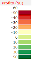
- ColorScale : No flexibility here. This has to be a range of 2 columns by Y rows, like for the Heatmap() UDF.

The first columns contains intervals or categories, in line with the values of the ColorRange area.
In front of each interval value, the 2nd column contains the RBG color code that will fill the sectors.
Color codes are available here and from Cynthia Brewer's ColorBrewer.
The color scale must be organized so that the lowest value is at the top, like in the screenshot from the previous post.

- LabelRange : Staightforward, range of cells (same size as DataRange again), containing the text for labels to be applyed to each sector.
I tried to maximize the size of the text inside the sector, like for tag-clouds, it emphasises the importance of big sectors in the treemap.
Labels will be displayed in black or in white, always maximizing the contrast against the background sector color.

- ToolTipRange : same as LabeRange, but this text will be displayed in a floating tooltip when hovering the mouse over the treemap.
Defenitely usefull to provide more detailed information than the label could.

- HighlightPosition : Integer number. Basically, it's the rank in the data range of the sector that you want to highlight. A red frame will be displayed around the corresponding sector... long to explain, easy to understand if you have come so far (Hopefuly!)

Regarding the VBA code.
1) it works reasonnably well. I tested it with 1 500 sectors with no trouble and great resolution in the smallest sectors
2) it is damn slow due to numerous iterations and loops, that could certainly be avoided by using collection or dictionnary objects instead of arrays.
3) Unlike C#, Silverlight or Java implementations, this code is not recursive... might be a reason why it's soooo slow.

Actually, this UDF is not a Treemap, rather a Branchmap... A treemap would have a fractal structure, with each sector including at least one embeded treemap, like real  tree-trunk with branches and leaves.

I you are interested to go further with Treemap, specific Treemaping softwares are listed here and more information available from the University of Maryland.

Last and not least.
The permantly-beta version of the add-in is available here (for XL2007 only)
An example file is available here.

Now you can create an interactive version of this nice Treemap from the NY Times... with Excel !

Felices fiestas !

Christmas Treemap !!

Right on time for Xmas delivery : a Treemap UDF joins the SfE toolbar.
Here goes the screenshot, explanations will follow !


Works more or less like the Heatmap() UDF and has contextual tooltip when hovering on a sector.
Ok, not a Sparkline anymore, but a usefull feature for dashboards.

I will come back after some debugging.

Cascade() v2

Just like for Pareto(), I updated the code of Cascade() so the entire chart is displayed with one formula only, located in the top cell of the chart.

The parameters used in this UDf are :

  • Points : range of values to be displayed - Mandatory
  • LegendRange : range of cells containing the text to be displayed next to each segment - Optional
  • Minimum : Value - Specifies the minimum value  of the chart - Optional
  • Maximum : Value - Specifies the maximum value of the chart - Optional 
  • ColorPositive : RGB color code for positive segments - Optional
  • ColorNegative : RGB color code for negative segments - Optional


In this screenshot, I use 3 overlapping Cascade() charts in order to visualize intermediary totals.

  • Chart 1 from Net sales to Operating Profit
  • Chart 2 from Operating Profit to Profit before tax
  • Chart 3 from  Profit before tax to Net profit

Successive charts share a commun value and identical scale (min and max values)

The chart is automatically drawn horizontally or vertically, and aligned with source values, according to the data layout.

I am however still not satisfied with the way the legend is handled.

The beta version of the add-in for XL2007 can be found here.
(again, if the file extension happens to be *.xlam.zip, just remove the ".zip")