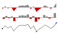
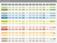
Cuboo sent me this example of dashboard used in a bank.
It shows how Piecharts (damn piecharts) can be used as a signal.
Here it comes to red, when actual stock is lower than stock at the beginning of the year.
For those of you who speak German, have a look at his site : http://openbi.info/
Here goes another one from AC for web traffic analysis, using bulletcharts, linecharts and variancecharts
A set of free User Defined Functions for Microsoft Excel® to create Sparklines :
the simple, intense, word-sized graphics invented by Edward Tufte & implemented by Fabrice Rimlinger.
LineChart and Horizontally arranged data
I just posted a new version of the template file for XL2003, including a correction for LineChart.
Ranges containing blank cells, errors or non numeric values are now properly displayed.
Still some work to do on the min/max tags... lets hope it rains this week end.
Download links :
Box.net
How LineChart deals with missing values (in template file)
After seeing somme comments about how LineChart handles (or not) missing values, I just downloaded and tested the template file from Sourceforge.
Here is the result... Looks OK to me.

There are however two problematic cases with LineChart.
1) the case of an isolated value : you need 2 values to draw a line, so individual poin will not be displayed if the GapStyle parameter is different than 1 or 2
2) when all values are identical and the scale (Min and Max) is not defined ... where should the resulting horizonal line be drawn ? In order to see it, specify Min and Max.
If you have found more cases, please send me a screenshot at : sparklines.excel - at- gmail.com
SourceForge bug ?
I received several mails complaining about the XL2007 add-in download on SourceForge.
If the file you download is "Sparklines.zip", just rename it as "Sparklines.xlam" and install it in your excel Trusted Zone directory.
I have not been able to reproduce this bug on the 4 or 5 computers, but just in case...
Simple trick, but annoying bug.
Choropleth Map of Romania
As I am spending most of my time in Bucharest, here goes a follow-up to Robert's post on his blog Clearly and Simply ...
An Excel Choropleth Map of Romania. Download HERE (243Kb - xls)

An Excel Choropleth Map of Romania. Download HERE (243Kb - xls)

Food for thought
Alberto Cairo. Visualization and knowledge. A short invitation to infographics
"Graphics works better than a table because, when give a visual shape to data, I'm creating a tool useful to accelerate (and sometimes replace) the processes the brain follow to reach its target"
"My personal method when I create infographic projects is very easy. It has three stages: research, planning and final art"
"The complexer the information gets, more basic should be the style to represent it"
Sparklines manual in German
Alois Eckl brings a great contribution to the project with a translation of the manual into German.
Vielen Dank für die Hilfe Alois !
Updated version of the manual
No big changes in the manual.
Correction of most of the errors and typos.
Merged Color codes tables with the manual.
I made some minor bug correction on both xla and xlam files... just in case.
Stand-alone template for XL2003
For those who do not want to install the add-in, and share easily file using Sparklines formulas,
Note : includes correction of missing values display in Linechart (cf Mike T comment )
Draft version of updated manual

It includes a short visual explanation of the different parameters used in the Sparklines formulas.
It does not include descriptions for Pareto(), Cascade() and Heatmap(), but these functions have not changed since previous versions.
For extra help, you can refer to the initial manual, still available here.
XL2007 and XL2003 v 3.4 add-in update online
V3.4 of the add-in for XL 2007 is available here.
V3.4 of the add-in for XL 2003 is available here. (zip)
Main enhancements :
- Icon for Horizon Chart
- Option to extrapolate gaps in linechart
- Syntax of Spreadchart has been modified (all parameters are numbers. Not text)
- For XL 2007, ribbon aspect has changed for more direct access to the "Refresh" icon
- Better handling of volatile functions (no more infinite loop while redrawing... but still one too much!)
New UserForm with possibility to :
- Activate / deactivate sparklines formulas
- Update the path of sparklines.xla (or xlam) for those who decided to install the add-in in special directory (by default : c:\program files\Sparklines)
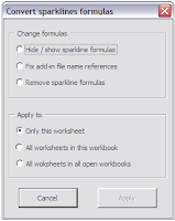
- Delete Sparklines formulas ( but leave the charts in place)
- Delete ALL shapes on the worksheet (including controls and Excel charts)
- Delete ONLY Sparklines (without deleting controls and Excel charts)
- Refresh Sparklines
Bugs correction :
- to many to be listed here, but according to my tests, the add-in is much more stable now, and faster at refreshing the shapes.... you'll let me know
BTRL for Bottom Top Right and Left
Quick one for Seb from my hotel in Constanza (Romania)
Values for the Scaleline "Orientation" parameter :
"B";"T";"R";"L" for Bottom; Top; Right and Left (not case sensitive)

Sparklines for XL 2007 - Update
Gustavo posted and update of the XL 2007 sparklines add-in.
It solves some minor bugs and adds AeraChart to the chart list.
The file is available HERE and on SourceForge.
Installer for pre-release of v3.4 for XL 2003
For the next release of Sparklines, I plan to use an installer to make things easier, just like Gustavo did for the XL 2007 add-in :
- The stand-alone version (*.xls)
- The color codes table in pdf
- The sparklines manual (permanent draft...)


The installer approach has several advantages :
- Several files packaged in one :
- The stand-alone version (*.xls)
- The color codes table in pdf
- The sparklines manual (permanent draft...)
- Possibility to choose the install directory
- An optional shortcut can be created in your Desktop menu (or on the desktop)

- Creation of an Uninstall file
- Easy upgrade of new versions
- If a new package is installed, files are overwritten.
- As the add-in is already registered in XL, the upgrade should be transparent
A downside too :
- Users will have to declare manually the add-in in Excel (not a big deal though...)
If you want to give it a try, the installer for pre-version 3.4 is available HERE.
New features of pre-v3.4 include :
Nixnut has been dedicating a lot of time to this one, and I struggle to keep up with all the features he is implementing... many thanks to him.
... and still in the pipe for the next releases :
- Sparkline chooser interface
- Standalone files creator (as requested by Robert here)
- Scatter plot chart
- Updated manual (embeded in the Sparklines Chooser)
- Recoding of Pareto and Cascade charts

As always,plenty of ideas, but we will just have to find the TIME to do all this !!
Auto-install add-in for Excel 2007
As I am not using XL2007, Gustavo from Buenos Aires (Argentina) brings a great contribution to the Sparklines for Excel project : an executable file that will copy the Excel 2007 add-in in a directory of your choice.
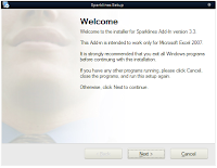
The default install directory is : c:\program Files\sparklines
The file is available HERE and HERE on SourceForge.
As Gustavo informed me, in order to use the add-in, you first have to add this install directory in Excel's "Trusted Zone":

The default install directory is : c:\program Files\sparklines
The file is available HERE and HERE on SourceForge.
As Gustavo informed me, in order to use the add-in, you first have to add this install directory in Excel's "Trusted Zone":
- Click the Microsoft Office Button
, and then click Excel Options.
- Click Trust Center, click Trust Center Settings, and then click Trusted Locations.
- If you want to create a trusted location that is not local to your computer, select the Allow trusted locations on my network (not recommended) check box.
- Click Add new location.
Important We recommended that you don't make your entire Documents or My Documents folder a trusted location. Doing so creates a larger target for a hacker to potentially exploit and increases your security risk. Create a subfolder within Documents or My Documents, and make only that folder a trusted location.
- In the Path box, type the name of the folder that you want to use as a trusted location, or click Browse to locate the folder.
- If you want to include subfolders as trusted locations, select the Subfolders of this location are also trusted check box.
- In the Description box, type what you want to describe the purpose of the trusted location.
- Click OK.
Sparklines gallery file on Clearly and Simply
Robert posted a on his blog "Clearly and Simply" an XL demo file of Sparklines.
This file (based on an XL2003 version) gives additional information regarding the different types of Boxplot and SpreadChart.
Thanks again Robert for your contribution to the project !
New templates from Argentina
You can't start a fire without a spark - Episode 1
I already mentionned Robert's blog "Clearly and Simply" in an earlier post.
Once again I must recommand you have a look at the great dashboard templates on his blog and an excellent 6 parts tutorial on Chandoo's blog.
Robert just posted a review of Sparklines for Excel, where he describes the pros and cons of the Sparklines User Defined Functions.
Here is his conclusion :
"Sparklines for XL are an excellent and cost-free implementation of sparklines. They are easy to understand and easy to use. From my point of view, with Sparklines for XL, Fabrice and Nixnut filled a gap in Excel's chart engine. One gap – among others - Microsoft was not able or willing to fill with Excel 2007.
Nevertheless I strongly recommend to always carefully consider whether or not sparklines are the best choice for your purposes. Sparklines are a great concept, but only in a context where they are appropriate. Sometimes they are the best way to visualize your data, sometimes a simple Excel standard chart will be sufficient and sometimes sparklines are definitely the wrong choice (e.g. if you need quantitative precision). Don't use them just for the sake of having them".
I can only agree with this.
If you have already tried to use sparklines to build a report, you already know that these small chart are just like Lego bricks... to have them working properly, you first have to work on the global architecture of your dashboard and put the right bricks together.
Define the key values to be displayed and prioritize them, organize the layout of the report. If you look for graphically dense information, where comparison is key, Sparklines are a great option. One of the most usefull property of UDF in general, is the ability to copy/paste them across a spreadsheet, just like any formula... and no problem to align them on the grid.
Robert... I am working on your wishlist, and might include this in the next release.
Sparklines v3.3 self standing template
Rado and Govi have requested self standing Sparklines template.
I posted a file that contains all sparklines functions but does not install as an add-in.
The advantage, is that it is easier to share "dynamic" files and you probably can bypass the administrator right for installing a file in the "program files" directory.
Downside ? files are some 500Ko bigger due to the code.
To use the file, download it, rename it, use it as a regular Excel file
The file is available here.
Let me know if any issue.
Ooops !
I just made some changes on the v3.3 for XL 2003, in order to propose Transparency parameters to Heatmaps.
The Picking Optimization file using heatmaps has be re-uploaded too.
Same thing for the Cycle Plot example that had Excel crashing ... don't know why though :(
Optimize warehouse picking efficiency with heatmap
Lets take a warehouse where goods are stored on shelves or pallets.
To prepare orders, you need to walk between the shelves and pick small items that are on your picking list and put them in a box.
Obviously, the shorter distance you need to walk to prepare an order, the more efficient you will be : less distance per order = more orders per hours.
One measure to implement is to setup 2 circuits :
- The short circuit, on which all fast movers products can be found. Ideally those products should cover 80% of your orders.
- The long circuits, on which all products, including slow movers can be picked
Heatmaps can help to quickly identify the slow movers and most ordered products.
A very optimized warehouse layout should look like this :
 Fast movers (red) on the short circuit. (blue) Slow movers (green) on the long circuit (orange).
In this Excel file, I have :
a 2 columns table, with the picking place ID and the picking frequency.
The simple layout of the warehouse in 2 versions :
Finally, 2 cells containing the Heatmaps formulas.
The transparent heatmap is layed over the layout showing the picking IDs.

With the data set I used, you can clearly see that the product on location A20 shouldn't be there.
 Fast movers (red) on the short circuit. (blue) Slow movers (green) on the long circuit (orange).
In this Excel file, I have :
a 2 columns table, with the picking place ID and the picking frequency.
The simple layout of the warehouse in 2 versions :
- One with cells containing a VLookup formula in order to retrieve the picking frequency of each location
- One with the picking locations ID
Finally, 2 cells containing the Heatmaps formulas.
The transparent heatmap is layed over the layout showing the picking IDs.

With the data set I used, you can clearly see that the product on location A20 shouldn't be there.
It should be at the very beginnig of the circuit, replacing the product located in B1. Same thing for D15, D12 and the orange location on the left of the blue dashed line.

I implemented this is a fruit and veg. warehouse some time ago.
Productivity increase was spectacular and workers happy to reduce their mileage ...
Now... why bother with heatmaps when this can be done with simple conditionnal formatting ?
Well, you might want to regroup products according to another criteria, that requires more than 3 colors.
Cycle plots with sparklines... in no time !
In January 2008, Naomi Robbins wrote an excellent article on how to display the evolution of seasonal data.
Finally, Charley Kyd proposed a very good tutorial on how to create cycle plots with Excel ... a rather long way, especially in the formatting process.
My turn to propose the Sparklines alternative. It took me less than a minute to create this chart.
It consits in 12 line charts, one per month, displayed in a narrow cell.
All cells obviously share the same vertical scale.
The red and blue points represent the minimum and maximum over 12 years.
It consits in 12 line charts, one per month, displayed in a narrow cell.
All cells obviously share the same vertical scale.
The red and blue points represent the minimum and maximum over 12 years.
Product sales analysis
Alessandro B. has been using Sparklines for Excel almost since the first version.
He is kindly sharing one of his sales dashboard, : Here

Note : not all cells contain Sparklines formulas
He is kindly sharing one of his sales dashboard, : Here

Note : not all cells contain Sparklines formulas
Clearly and Simply... great templates for dashboards.
For the Excel user looking for serious dashboard templates and and first class tips, I strongly recommand to visit Robert's new blog : Clearly and Simply.
My favorite posts so far :


The best of all ? Almost NO VBA involved...
A site to bookmark ... NOW !
Keep the posts coming Robert.
My favorite posts so far :
- Take care of customers : provides a superb, minimalist template of dynamic customer satisfaction dashboard.
- Lithuania at a glance : another brilliant example of clean and complete layout.
The best of all ? Almost NO VBA involved...
A site to bookmark ... NOW !
Keep the posts coming Robert.
Variance analysis example
Here is an example file of a variance analysis I had to do recently, including raw data.

It works pretty well, although I would prefer to have separate reports for sales and margin, and not split in 2 consecutive lines like here.
The file is available here.
Note : this file does not contain any code. The Sparklines add-in must be installed before using it.
I modified the code on my machine in order to identify bars that have in this case more than 100% variance (white triangle in the screenshot).
Excel, Palo and Sparklines
Cuboo is promoting openBI : Business Intelligence based on open source software.
His last post gives an example of how Palo, Excel and Sparklines for Excel can be used to create dashboards.
Not only Palo is a powerfull open-source database and Olap server, it also provides a great add-in, that allows users to easily embed pivot-table in Excel... very powerfull indeed.
The last step is to integrate sparklines for quick and efficient visualization.
Here is his article : “Pimp my spreadsheet” with Palo, and a screenshot of a dashboard using Sparklines for Excel.
Stick to the classics ?
I could not resist to post the VariChart version of the previous infographic.
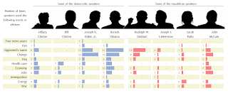
It looks more readable to me...
File here.

It looks more readable to me...
File here.
Yes we can !
Robert just sent me an excellent example of heatmap use, based on a NY Times infographic and a recent post on Juice Analytics.
Juice Analytics gave up trying with Excel, but Robert said "Yes we can" et voilà !
The NY Times chart.

Robert's replica with Sparklines for XL heatMap function.

The file is available for download here.
Note : Robert added one line in the code to make the circles transparent, so the text behind could be seen.
Robert is also contribuiting to Chandoo's excellent blog Pointy Haired Dilbert.
Juice Analytics gave up trying with Excel, but Robert said "Yes we can" et voilà !
The NY Times chart.

Robert's replica with Sparklines for XL heatMap function.

The file is available for download here.
Note : Robert added one line in the code to make the circles transparent, so the text behind could be seen.
Robert is also contribuiting to Chandoo's excellent blog Pointy Haired Dilbert.
6.795 m = 22.293 ft
Yes, we did it !!

On December 11th at 1 PM, after 3 days on the mountain, we reached the summit of Mount Pissis (6.795m), the 3rd highest mountain of Americas and second highest volcano on earth.
As Aconcagua's -6992m- season had not started and distant Ojos del Salado - 6880m- was under strong winds.. we probably were the highest men on earth that day...
Great moments indeed, but certainly one he hardest thing I've ever done.
More pictures here and here.
Back to work... and to Sparklines.
UDF, add-ins and sharing files
Here is one comment posted recently :
"I am having some trouble with sharing files.
If I pass my file to a co-worker who has installed the add-in,all the formulas fail to work and checking them , cell formula changed to :
='C:\Documents and Settings\myusername\ApplicationData\Microsoft\AddIns\Sparklines_3.2.2.RNO.xla'!linechart('PI Data2'!I11:I299,,0,150,G13/24)"
Annoying indeed...
The first versions of sparklines were Excel files that could be used as templates, with the advantage that the VBA code was embedded into the file, so no problem to share those files.
This no longer the case with add-ins.
The *.xla file, containing the code is saved in your add-in library, which location changes for each different user :C:\Documents and Settings\myusername\ApplicationData\Microsoft\AddIns\
To solve this, the add-in release I just posted (3.2.3 for XL2003 + 3.2.6 for XL2000) will now be installed in C:\Program files\Sparklines... and nowhere else !
This should satisfy many users, but I already can hear "I am working wit Citrix", "I have not admin rights, I cannot install anything on C:"... one step at a time, we'll address that later.
PS : Remember to uninstall the previous versions of the add-in (last option of the Sparklines menu) before installing this new release.
PS2 : I'll be off-line for 2 weeks... absolutely unreachable (yes, it is still possible !), mountain climbing in Argentina between Mount Incahuasi (6.610m) and Pissis (6.795m)... see ya!
First example file
Nixnut posted an example workbook on how to use Sparklines for Excel functions in dashboards.
This file mimics the winning dashboard of the 2006 Data Visualization Contest.

You can read Stephen Few's analysis of the original dashboards here.
This file mimics the winning dashboard of the 2006 Data Visualization Contest.

You can read Stephen Few's analysis of the original dashboards here.
Release 3.2.3 for Excel 2003
I just posted a new release for Excel 2003 here.
This version includes logarithmic horizontal scales (required for the OECD file of my previous post).
It also brings some changes on Nixnut last statistical functions : StripeChart and SpreadChart used to analyze a population distribution.
It solves a clipboard issue (the clipboard was erased whenever the "Sparklines" menu was re-created).
I hope you will find those improvement helpful.
In the future I will post some samples on how to use the function, individually or organized within a dashboard.
How to use BoxPlot charts
Jon Peltier wrote a post on his blog regarding a chart from The Economist on “Income distribution by decile in selected OECD countries”.
Here is a simple interpretation of this chart using "boxplot" charts with standard and logarithmic scale :
You can download the excel data file here and use it once the Sparklines for Excel add-in is installed on your computer.
Here is a simple interpretation of this chart using "boxplot" charts with standard and logarithmic scale :
You can download the excel data file here and use it once the Sparklines for Excel add-in is installed on your computer.
Release 3.2.5 for Excel 2000.
I have had a great deal of help from Holland during the last weeks.
Nixnut is using XL-2000. He is very knowledgeable about statistics, and rewrote some (big) parts of the code.
Here is Nixnut last XL-2000 version of Sparklines for Excel.
This release bring some new charts :
StripeChart : It shows a vertical marker line for each value in the range and optionally a taller red line for the average mean. The result is a graph with the distribution of the values in the range.
SpreadChart : A lot like the StripeChart except it shows the frequency distribution of the values in the range in one of three styles: stacked (default), spread or jittered.
It uses dots for the data points.
XBoxPlot (Extended Boxplots). A bit experimental. These boxplots take a range as input and calculate values for whiskers, hatch marks, boxes and outliers as necessary.
There are different classes of boxplots: Tukey (default), 5NS (five number summary), 7NS (seven number summary), and Bowley.
There are also two styles: Classic (default) and Neo. The Neo style shows bars instead of whiskers.
Visible enhancements of existing functions : Invisible enhancements :
A great deal of very useful Sparklines, dense, self explanatory and easy to embed in dashboards.
This new version is not documented yet...
Well, it seems that I will have to catch up with the XL2003 version... any volunteer for XL2007 ?
Nixnut is using XL-2000. He is very knowledgeable about statistics, and rewrote some (big) parts of the code.
Here is Nixnut last XL-2000 version of Sparklines for Excel.
This release bring some new charts :
StripeChart :
 It shows a vertical marker line for each value in the range and optionally a taller red line for the average mean. The result is a graph with the distribution of the values in the range.
 SpreadChart :
 A lot like the StripeChart except it shows the frequency distribution of the values in the range in one of three styles: stacked (default), spread or jittered.
It uses dots for the data points.
XBoxPlot (Extended Boxplots). A bit experimental. These boxplots take a range as input and calculate values for whiskers, hatch marks, boxes and outliers as necessary.
There are different classes of boxplots: Tukey (default), 5NS (five number summary), 7NS (seven number summary), and Bowley.
There are also two styles: Classic (default) and Neo. The Neo style shows bars instead of whiskers.
Visible enhancements of existing functions : Invisible enhancements :
- Improved "Redraw" and "Delete" routines.
- Version number not included in file name, for easier upgrade.
A great deal of very useful Sparklines, dense, self explanatory and easy to embed in dashboards.
This new version is not documented yet...
Well, it seems that I will have to catch up with the XL2003 version... any volunteer for XL2007 ?
New set of Sparklines UDF
Sparklines v3.2.2 is available on Sourceforge.
This new version can be used as a stand alone workbook(*.xls) or as a permanent Excel add-in (*.xla).
Creation of sparklines is made available through a menu and a toolbar, or by typing the function directly in a cell.
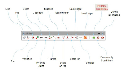
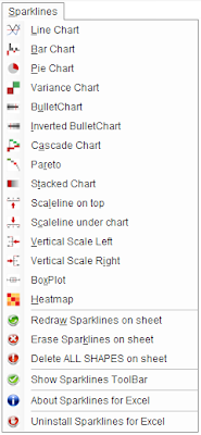
Get a copy of the file here . last Version 3.2 for Excel 2003 - October 24th 2008
To insert a Sparkline, use the Sparkline Menu or Toolbar.
Fill the function argumentsin the Function Wizard.

Some Sparklines do not display properly when first created with the Function Wizard.
Just update them with the "Redraw Sparklines" option of the menu or toolbar.
Please give me some feedback, share your ideas and I will do my best to improve the functions.

This new version can be used as a stand alone workbook(*.xls) or as a permanent Excel add-in (*.xla).
Creation of sparklines is made available through a menu and a toolbar, or by typing the function directly in a cell.


Get a copy of the file here .
Several versions are available for download :
- Version 3.2.2 the last one for XL 2003 only . CAN BE INSTALLED AS AN ADD-IN.
- For Excel 2007 users, use the Template file (no interactive examples)
- Version 2.3.1 Mac, tested on Excel 2004 for Apple Mac.
To insert a Sparkline, use the Sparkline Menu or Toolbar.
Fill the function argumentsin the Function Wizard.

Some Sparklines do not display properly when first created with the Function Wizard.
Just update them with the "Redraw Sparklines" option of the menu or toolbar.
Please give me some feedback, share your ideas and I will do my best to improve the functions.

Heatmaps
It is now possible to create arrays of PieCharts, of variable sizes and colors, through the Heatmap() function.
In addition to the disc position in the array, 3 variables are displayed :
In addition to the disc position in the array, 3 variables are displayed :
Versions log
Sparklines v 3.2
New Features
Minor Changes
Sparklines v 3.0
New Features
- Possibility to install as an add-in for Excel. Take care if you want to distribute files created with the add-in, the Sparklines function will not work on other users' PC.
- Menu and Toolbar - All functions can be accessed via those 2 means
- Vertical ScaleLine - Display a a vertical measure scale next to Linecharts, BarCharts or Heatmaps. Choose left or right size.
Minor Changes
- Heatmap - now includes the possibility to create arrays of piecharts, with variable size and colors
- LineChart - Corrected error handling of min and max values
- StackedChart - Reviewed the display of legend, in order to fit in segments
- Pareto- Reviewed the display of legend
Sparklines v 3.0
- All charts - added possibility to embed intermediary formulas inside the UDFs)
- All charts - Each Sparklines is properly renamed (Type, active sheet and position)
- PieChart - New type of chart Heatmap - New type of chart, suitable for 2D and 3D heatmaps (Size + Color)
- Boxplot - New type of chart
- BarChart Added one new parameter (color) to choose the color of the bars
- LineChart - Added parameters for colors of lines
- BulletChart - Added possibility to choose a color scheme
- ScaleLine - Added 3 text zone (Left ; center ; right) and choice of font size
- VariChart - Added possibility to choose a color scheme
- Color Scales pdf file- 2 separate sheets with well balanced color scales.
- Macro to delete Sparklines on the active sheet, but Sparklines only.
Scaleline() specifications
Subscribe to:
Posts (Atom)


